It is that time of the year where it seems like there is some type of meeting every week. In many of these meetings, data is presented to show the effectiveness of the products versus other products or a control. Statistics are often used to determine if there is a true difference between the treatments by taking into account the field variability within the data set.
It may be asked, “What do you mean by true difference?” In this case, a true statistical difference is not due to random chance or variability within the plot, but rather due to the treatment applied. Variability is a common feature of orchards – we are all aware that some trees produce more than others for a variety of factors. By taking into account the variability of the data collected for each treatment, differences, if they exist, can be determined. To do this properly, the design of the experiment must be large enough to account for this variability. This is why experiments that are conducted by researchers tend to be pretty extensive — because we want to make sure that the differences observed are not due to the variability within the field.
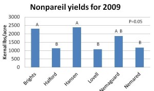
You may be thinking, “Well, that is great and all, but what does it all mean?” To interpret the data, most of the times it is presented as a graph. A graph is a visual representation of data, and often compares the response (vertical line, y-axis) of multiple treatments (bottom line, x-axis). Many times there are letters and other values noted on the graph. These values are very important. If we were to use figure one as an example, we can see that we have letters over different bars/rootstocks. These letters indicate significantly different groupings at a certain level of confidence. In figure one, the rootstocks ‘Brights,’ ‘Hanson,’ and ‘Nemaguard’ all have an “A” above the bar, indicating that they are equal in yields – even though ‘Hanson’ has a higher bar (remember the comments about variability). ‘Lovell,’ ‘Nemared,’ Nemaguard,’ and ‘Halford,’ have a letter ‘B’ above the bar. Since this letter is different, these rootstocks performed statistically different than the ‘A’ group. Of note is ‘Nemaguard,’ it has both an “A” and “B”. This indicates that it is not different from either the “A” or “B” group. It does not mean that it is a third group. A correct statement from this table would be: “The rootstocks ‘Brights’ and ‘Hanson’ outperformed ”Lovell,’ ‘Nemared,’ and ‘Halford.'” Notice ‘Nemagurd’ is not mentioned since it did not outperform the three rootstocks. It is kind of stuck in “no-mans-land.”
When looking at the graph, you may notice the label “p=0.05.” This is the level of confidence in the data for the trial conditions. This value is the chance that the data could be incorrect due to sampling error/variability within the plot. Another way to hear or read this point would be “We are 95% confident that the differences within these rootstocks are correct for the conditions of this trial.” Field scientists often use a “p-value” of 0.05 or 0.10. Since this is one trial, the conclusions can only be drawn from the conditions of the trial, and therefore can not be extrapolated to other conditions (soil, water, climate, etc.). Only by replicating this trial over time and space can we widen the conclusions to a larger area.
I hope this brief article will help with the understanding of the amount of data that you will be observing over the next few weeks. Don’t assume that a bigger bar means a response – it may not be a real response due to experimental design/field variability (think outside row v/s the third row). Rather, look for the application of statistics to help differentiate true differences within the trial.


Pete Goodell
February 6, 2013Also, take time to note the scale of the graph. I have seen many results presented in which results are exaggerated. This is commonly done by not using “0” as mininum value on Y-axis but another figure which emphasizes the difference between two results.
David Doll
February 6, 2013Thanks Pete! That is a great point. It is very easy for small differences to appear large when the y-axis scale is adjusted.
Brett Rosenzweig
February 7, 2013Another good article Dave. Keep up the good work!
David Doll
February 7, 2013Thanks Brett! I hope you are doing well. We are quickly approaching bloom. So far, so good.